i-PRO Americas Design System
i-PRO Americas Design System
i-PRO Americas Design System
i-PRO Americas Design System
i-PRO Americas Design System

Background
Background
i-PRO (previously known as Panasonic) is a security technology company that specializes in advanced video surveillance and public safety solutions.
i-PRO (previously known as Panasonic) is a security technology company that specializes in advanced video surveillance and public safety solutions.
My role
My role
UX Designer
Sole UX designer leading the new design system while continuing to support the portal redesign.
UX Designer
Sole UX designer leading the new design system while continuing to support the portal redesign.
UX Designer
Sole UX designer leading the new design system while continuing to support the portal redesign.
UX Designer
Sole UX designer leading the new design system while continuing to support the portal redesign.
UX Designer
Sole UX designer leading the new design system while continuing to support the portal redesign.
Challenge
Challenge
To build a global design system to help with inconsistent UI, improve accessibility, and scale across teams.
To build a global design system to help with inconsistent UI, improve accessibility, and scale across teams.
Problem
Problem
Why was a design system needed?
i-PRO has multiple products across platforms and they don't relay that they are one brand. Teams were having problems on figuring out what was the correct size to use. This led to tons of inconsistencies.
Why was a design system needed?
i-PRO has multiple products across platforms and they don't relay that they are one brand. Teams were having problems on figuring out what was the correct size to use. This led to tons of inconsistencies.
Why was a design system needed?
i-PRO has multiple products across platforms and they don't relay that they are one brand. Teams were having problems on figuring out what was the correct size to use. This led to tons of inconsistencies.
Why was a design system needed?
i-PRO has multiple products across platforms and they don't relay that they are one brand. Teams were having problems on figuring out what was the correct size to use. This led to tons of inconsistencies.
Why was a design system needed?
i-PRO has multiple products across platforms and they don't relay that they are one brand. Teams were having problems on figuring out what was the correct size to use. This led to tons of inconsistencies.
Preview of the marketing site with the design system

Building the Cosmo design system
Discover
Why are inconsistencies still happening?
Auditing cross platforms
Accessibility and design standards
Discover
Why are inconsistencies still happening?
Auditing cross platforms
Accessibility and design standards
Discover
Why are inconsistencies still happening?
Auditing cross platforms
Accessibility and design standards
Discover
Why are inconsistencies still happening?
Auditing cross platforms
Accessibility and design standards
Discover
Why are inconsistencies still happening?
Auditing cross platforms
Accessibility and design standards
Define
The 5 W's
Outlining the key foundational elements
Define
The 5 W's
Outlining the key foundational elements
Define
The 5 W's
Outlining the key foundational elements
Define
The 5 W's
Outlining the key foundational elements
Define
The 5 W's
Outlining the key foundational elements
Develop
Creating the core component library
Design documentation
Develop
Creating the core component library
Design documentation
Develop
Creating the core component library
Design documentation
Develop
Creating the core component library
Design documentation
Develop
Creating the core component library
Design documentation
Deliver
Updated redesign
Where do we go from here?
Deliver
Updated redesign
Where do we go from here?
Deliver
Updated redesign
Where do we go from here?
Deliver
Updated redesign
Where do we go from here?
Deliver
Updated redesign
Where do we go from here?
Discover
Where and why are inconsistencies still happening?
As I was working on the EZ-2 partner portal with three UX design interns, I discovered there were many inconsistencies happening. There is no clear documentation of brand guidelines, therefore the design and developer team continues to create mistakes. Multiple variables of the same color, 10 of the same button, inconsistent spacing, and more.

Poor accessbility
Poor accessbility
Poor accessbility
Poor accessbility
Links that are similar to text color
Links that are similar to text color
Links that are similar to text color
Links that are similar to text color
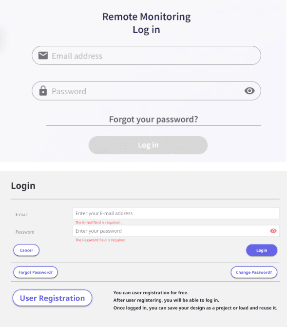
Two styles of input
Two styles of input
Two styles of input
Two styles of input
Poor accessbility
Links that are similar to text color
Two styles of input


Multiple variables of the same colors
Multiple variables of the same colors
Multiple variables of the same colors
Multiple variables of the same colors
Multiple variables of the same colors

Poor accessbility
Poor accessbility
Poor accessbility
Poor accessbility
Poor accessbility


Different colors, font style, and button size
Different colors, font style, and button size
Different colors, font style, and button size
Different colors, font style, and button size
Different colors, font style, and button size
Auditing cross platforms
Auditing cross platforms
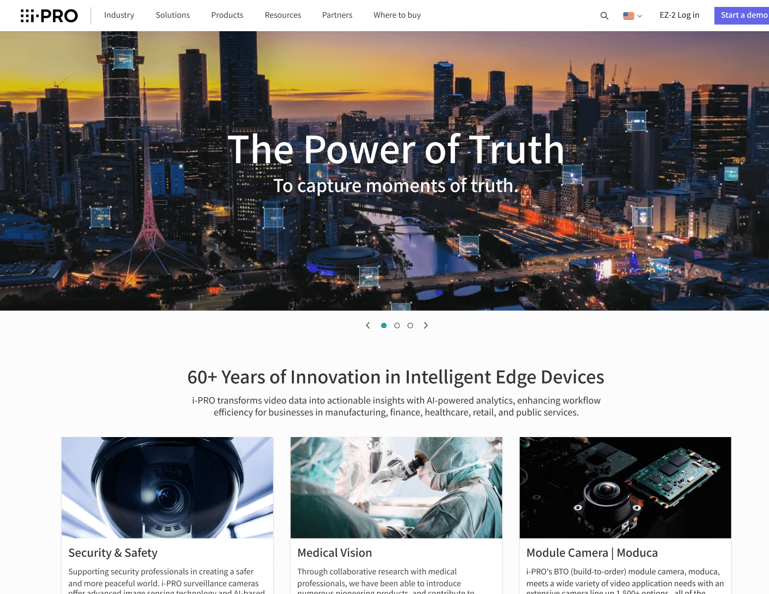
With multiple platforms i-PRO has to offer, there comes a cost to it
If there is no one maintaining and overseeing the design, inconsistencies happen.
I audited the marketing website and found multiple buttons and cards of different rest and hover styles.
On a different web tool i-PRO offers, they overused the brand color which could cause the user to feel overwhelmed and lost. There is no clear hierarchy which makes it difficult to navigate around.
With multiple platforms i-PRO has to offer, there comes a cost
If there is no one maintaining and overseeing the design, inconsistencies happen.
I audited the marketing website and found multiple buttons and cards of different rest and hover styles.
On a different web tool i-PRO offers, they overused the brand color which could cause the user to feel overwhelmed and lost. There is no clear hierarchy which makes it difficult to navigate around.
With multiple platforms i-PRO has to offer, there comes a cost to it
If there is no one maintaining and overseeing the design, inconsistencies happen.
I audited the marketing website and found multiple buttons and cards of different rest and hover styles.
On a different web tool i-PRO offers, they overused the brand color which could cause the user to feel overwhelmed and lost. There is no clear hierarchy which makes it difficult to navigate around.
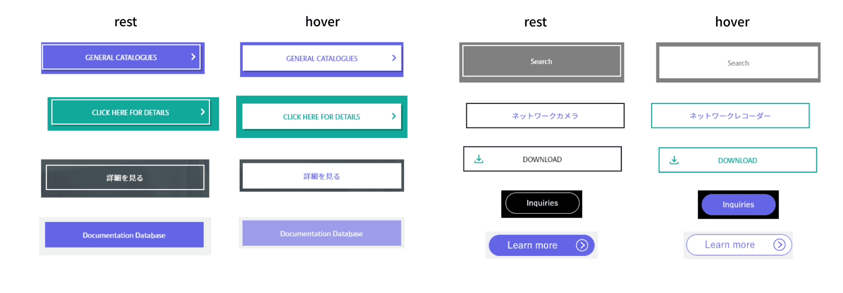
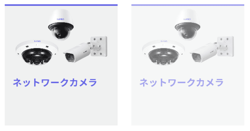
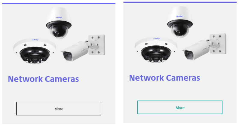
Different rest and hover states for buttons and cards
No hierarchy, contrast, or brand consistency in two web products
Different rest and hover states for buttons and cards
No hierarchy, contrast, or brand consistency in two web products
Different rest and hover states for buttons and cards
No hierarchy, contrast, or brand consistency in two web products
Different rest and hover states for buttons and cards
No hierarchy, contrast, or brand consistency in two web products
Different rest and hover states for buttons and cards
No hierarchy, contrast, or brand consistency in two web products
Different rest and hover states for buttons and cards
No hierarchy, contrast, or brand consistency in two web products
Different rest and hover states for buttons and cards
No hierarchy, contrast, or brand consistency in two web products
Different rest and hover states for buttons and cards
No hierarchy, contrast, or brand consistency in two web products
Different rest and hover states for buttons and cards
No hierarchy, contrast, or brand consistency in two web products
Different rest and hover states for buttons and cards
No hierarchy, contrast, or brand consistency in two web products
Different rest and hover states for buttons and cards
No hierarchy, contrast, or brand consistency in two web products
Different rest and hover states for buttons and cards
No hierarchy, contrast, or brand consistency in two web products
Different rest and hover states for buttons and cards
No hierarchy, contrast, or brand consistency in two web products
Different rest and hover states for buttons and cards
No hierarchy, contrast, or brand consistency in two web products
Different rest and hover states for buttons and cards
No hierarchy, contrast, or brand consistency in two web products
Different rest and hover states for buttons and cards
No hierarchy, contrast, or brand consistency in two web products
Different rest and hover states for buttons and cards
No hierarchy, contrast, or brand consistency in two web products
Different rest and hover states for buttons and cards
No hierarchy, contrast, or brand consistency in two web products
Different rest and hover states for buttons and cards
No hierarchy, contrast, or brand consistency in two web products
Different rest and hover states for buttons and cards
No hierarchy, contrast, or brand consistency in two web products
Accessibility and design standards
Accessibility and design standards
Gaps in accessibility
There are no clear focus states or keyboard navigation support
No ARIA labels
Inconsistent color contrast ratios across components
Gaps in accessibility
There are no clear focus states or keyboard navigation support
No ARIA labels
Inconsistent color contrast ratios across components
Gaps in accessibility
There are no clear focus states or keyboard navigation support
No ARIA labels
Inconsistent color contrast ratios across components
Gaps in accessibility
There are no clear focus states or keyboard navigation support
No ARIA labels
Inconsistent color contrast ratios across components
Gaps in accessibility
There are no clear focus states or keyboard navigation support
No ARIA labels
Inconsistent color contrast ratios across components
Design inconsistencies
Multiple versions of the same component
Inconsistent spacing, type scales, and layout structures
Designs deviated from the brand look and feel across different products
Design inconsistencies
Multiple versions of the same component
Inconsistent spacing, type scales, and layout structures
Designs deviated from the brand look and feel across different products
Design inconsistencies
Multiple versions of the same component
Inconsistent spacing, type scales, and layout structures
Designs deviated from the brand look and feel across different products
Design inconsistencies
Multiple versions of the same component
Inconsistent spacing, type scales, and layout structures
Designs deviated from the brand look and feel across different products
Design inconsistencies
Multiple versions of the same component
Inconsistent spacing, type scales, and layout structures
Designs deviated from the brand look and feel across different products
Define
The 5 W's
To understand the purpose and scope, I asked five key questions who, what, where, when, and why to define the foundation of the design system to ensure its built to scale and sustainably.
Define
The 5 W's
To understand the purpose and scope, I asked five key questions who, what, where, when, and why to define the foundation of the design system to ensure its built to scale and sustainably.
Define
The 5 W's
To understand the purpose and scope, I asked five key questions who, what, where, when, and why to define the foundation of the design system to ensure its built to scale and sustainably.
Define
The 5 W's
To understand the purpose and scope, I asked five key questions who, what, where, when, and why to define the foundation of the design system to ensure its built to scale and sustainably.
Define
The 5 W's
To understand the purpose and scope, I asked five key questions who, what, where, when, and why to define the foundation of the design system to ensure its built to scale and sustainably.
Who is the design system for?
Who is the design system for?
Who is the design system for?
For the designers and developers across the U.S., Japan, and Europe as well as, internal teams working on other platforms for brand consistency.
What problems is it solving?
What problems is it solving?
What problems is it solving?
Repititve designs in UI components, lack of documentation or standards, slow prototyping and iterations
Where will it be used?
Where will it be used?
Where will it be used?
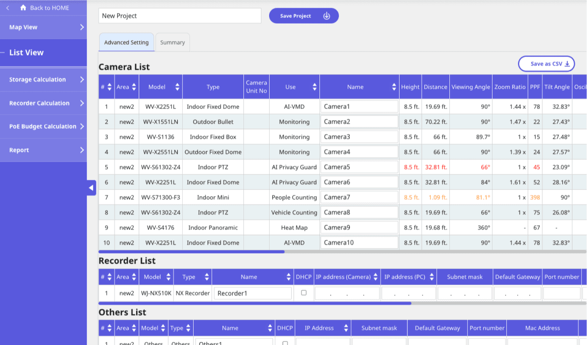
On multiple platforms like, EZ-2 partner portal, desktop apps (Video Insight, Access Control, and ActiveGuard), main i-PRO marketing website, internal tools used by sales, finance, and support.
When will it be adopted?
When will it be adopted?
When will it be adopted?
Would be adopted incrementally as new features and components are developed. Has a long term rollout planned for global alignment.
Why now?
Why now?
Why now?
Global teams noticed inefficiencies and visual inconsistencies. Having a design system would improve efficiency, hand offs, and reduce dev work.
Develop
Designing for scale
To keep in mind the ecosystem that i-PRO has in web, desktop, and for the future mobile applications. I designed a system with scalability and flexibility in mind. By building for scale from the start, it could ensure a long term efficiency, brand consistency, and ease of implementation across platforms and teams.

Deliver
Updated redesign
After multiple iterations and incorporating user and stakeholder feedback, we finalized the prototype flow and submitted it to the developers. This helps the team to begin building the updated experience for layout, flow, and behavior.
Deliver
Updated redesign
After multiple iterations and incorporating user and stakeholder feedback, we finalized the prototype flow and submitted it to the developers. This helps the team to begin building the updated experience for layout, flow, and behavior.
Deliver
Updated redesign
After multiple iterations and incorporating user and stakeholder feedback, we finalized the prototype flow and submitted it to the developers. This helps the team to begin building the updated experience for layout, flow, and behavior.
Deliver
Updated redesign
After multiple iterations and incorporating user and stakeholder feedback, we finalized the prototype flow and submitted it to the developers. This helps the team to begin building the updated experience for layout, flow, and behavior.
Deliver
Updated redesign
After multiple iterations and incorporating user and stakeholder feedback, we finalized the prototype flow and submitted it to the developers. This helps the team to begin building the updated experience for layout, flow, and behavior.
i-PRO marketing site

Before
After
EZ-2 Partner Portal

Before
After: Applying DS without changing layout
New EZ-2 Dashboard
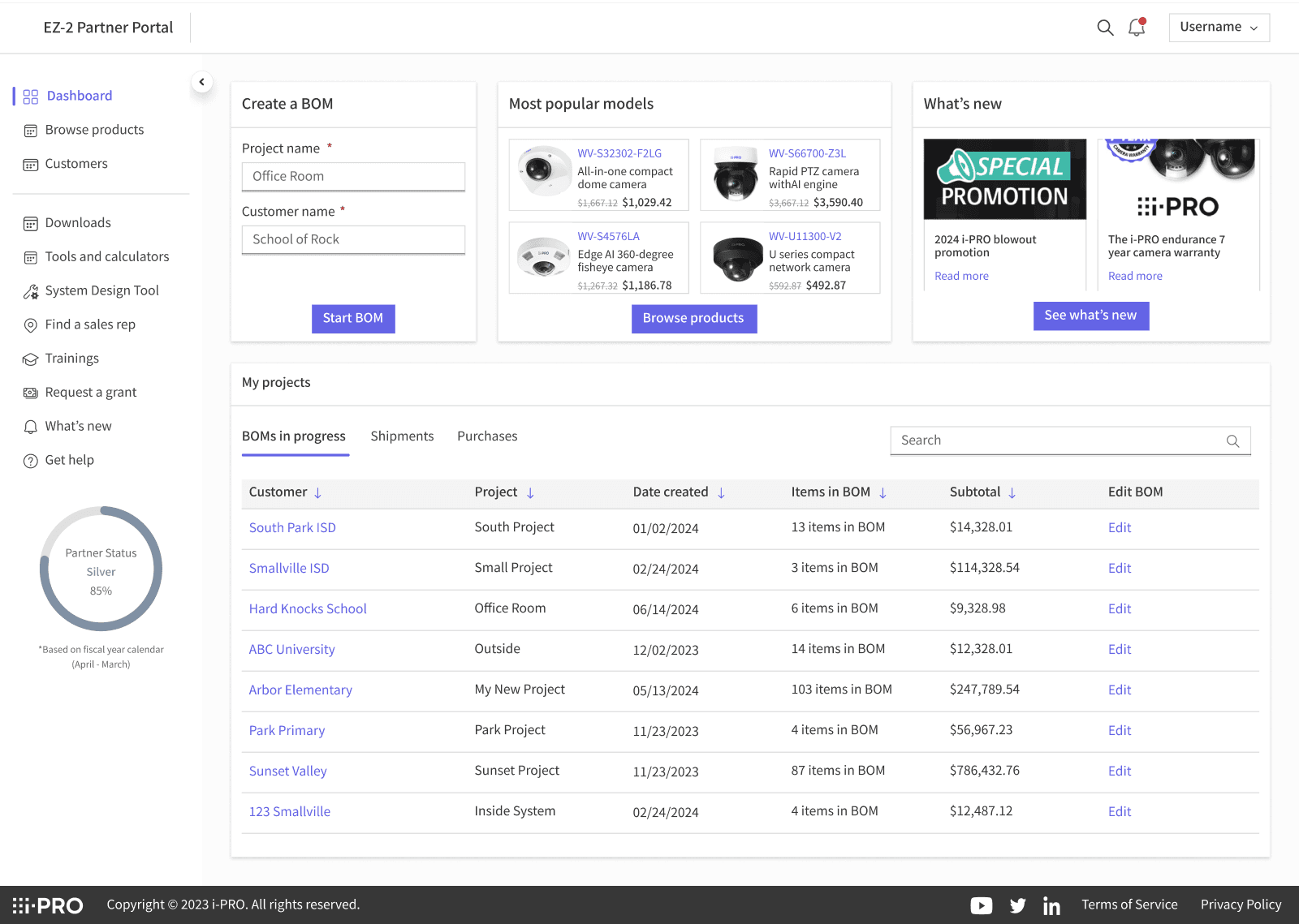
Light mode
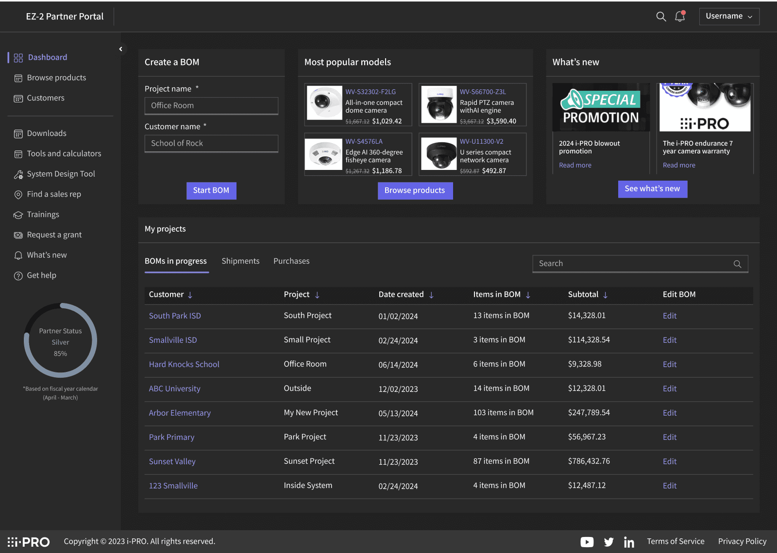
Dark mode
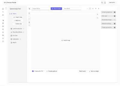
System Design Tool
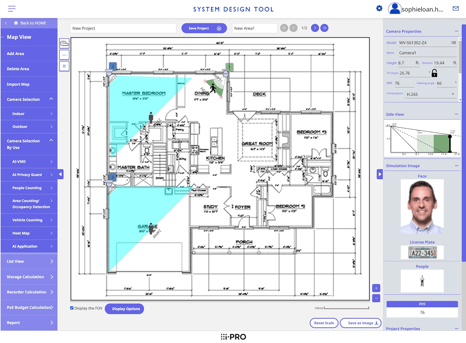
Before
After
i-PRO marketing site
Before
After
EZ-2 Partner Portal
Before
After: Applying DS without changing layout
New EZ-2 Dashboard
Light mode
Dark mode
System Design Tool
Before
After
i-PRO marketing site
Before
After
EZ-2 Partner Portal
Before
After: Applying DS without changing layout
New EZ-2 Dashboard
Light mode
Dark mode
System Design Tool
Before
After
i-PRO marketing site
Before
After
EZ-2 Partner Portal
Before
After: Applying DS without changing layout
New EZ-2 Dashboard
Light mode
Dark mode
System Design Tool
Before
After
i-PRO marketing site
Before
After
EZ-2 Partner Portal
Before
After: Applying DS without changing layout
New EZ-2 Dashboard
Light mode
Dark mode
System Design Tool
Before
After
i-PRO marketing site
Before
After
EZ-2 Partner Portal
Before
After: Applying DS without changing layout
New EZ-2 Dashboard
Light mode
Dark mode
System Design Tool
Before
After
i-PRO marketing site
Before
After
EZ-2 Partner Portal
Before
After: Applying DS without changing layout
New EZ-2 Dashboard
Light mode
Dark mode
System Design Tool
Before
After
i-PRO marketing site
Before
After
EZ-2 Partner Portal
Before
After: Applying DS without changing layout
New EZ-2 Dashboard
Light mode
Dark mode
System Design Tool
Before
After
i-PRO marketing site
Before
After
EZ-2 Partner Portal
Before
After: Applying DS without changing layout
New EZ-2 Dashboard
Light mode
Dark mode
System Design Tool
Before
After
i-PRO marketing site
Before
After
EZ-2 Partner Portal
Before
After: Applying DS without changing layout
New EZ-2 Dashboard
Light mode
Dark mode
System Design Tool
Before
After
i-PRO marketing site
Before
After
EZ-2 Partner Portal
Before
After: Applying DS without changing layout
New EZ-2 Dashboard
Light mode
Dark mode
System Design Tool
Before
After
i-PRO marketing site
Before
After
EZ-2 Partner Portal
Before
After: Applying DS without changing layout
New EZ-2 Dashboard
Light mode
Dark mode
System Design Tool
Before
After
i-PRO marketing site
Before
After
EZ-2 Partner Portal
Before
After: Applying DS without changing layout
New EZ-2 Dashboard
Light mode
Dark mode
System Design Tool
Before
After
i-PRO marketing site
Before
After
EZ-2 Partner Portal
Before
After: Applying DS without changing layout
New EZ-2 Dashboard
Light mode
Dark mode
System Design Tool
Before
After
i-PRO marketing site
Before
After
EZ-2 Partner Portal
Before
After: Applying DS without changing layout
New EZ-2 Dashboard
Light mode
Dark mode
System Design Tool
Before
After
i-PRO marketing site
Before
After
EZ-2 Partner Portal
Before
After: Applying DS without changing layout
New EZ-2 Dashboard
Light mode
Dark mode
System Design Tool
Before
After
i-PRO marketing site
Before
After
EZ-2 Partner Portal
Before
After: Applying DS without changing layout
New EZ-2 Dashboard
Light mode
Dark mode
System Design Tool
Before
After
i-PRO marketing site
Before
After
EZ-2 Partner Portal
Before
After: Applying DS without changing layout
New EZ-2 Dashboard
Light mode
Dark mode
System Design Tool
Before
After
i-PRO marketing site
Before
After
EZ-2 Partner Portal
Before
After: Applying DS without changing layout
New EZ-2 Dashboard
Light mode
Dark mode
System Design Tool
Before
After
i-PRO marketing site
Before
After
EZ-2 Partner Portal
Before
After: Applying DS without changing layout
New EZ-2 Dashboard
Light mode
Dark mode
System Design Tool
Before
After
Impact
Impact
Building Cosmos allowed a scalable foundation that empowered teams across i-PRO.
Creating core components, design tokens, and brand standards allowed consistency across global platforms. This reduced duplicated designs by 60%.
Providing documentation helped cross-functional teams-designers, developers, and marketing to be more aligned and shortened the time to final handoff by ~30%.
Reflection
Reflection
If I had more time...
I would have components be even more flexible by using design tokens instead making multiple variants of one component. Figma files takes up a lot of memory so the files start to slow down. I wasn't able to fulfill this during my time at i-PRO because I was still in the process of learning design tokens.
I would explored further into applying the design system into other i-PRO applications.
Key learnings & takeaways
I started off with knowing nothing about design systems, but doing this project allowed me to understand the importance of having one. Having the consistency, scalability, and collaboration between teams plays big impact.
I enjoyed going deep into the details of a component, making it pixel perfect, finding the right accessibility, and helping others. That's when I discovered that I wanted to specialize in design systems.
I started to take more courses and attend talks to expand my knowledge to apply for future projects.

