Fundr SaaS Platform
Overview
The mission is to transform Fundr into a hub for seed investing. Through innovative design, we strive to eliminate bias, increase access, and streamline funding processes, ensuring equal opportunities for world-changing ideas.
My Role
UX/UI Designer
I was responsible for redesigning the platform, including usability testing, and finalizing designs to achieve user and business objectives.
I also collaborated with an amazing team of UX designers to interview the stakeholders.
UX/UI Designer
I was responsible for redesigning the platform, including usability testing, and finalizing designs to achieve user and business objectives.
I also collaborated with a team of UX designers to interview the stakeholder.
Challenge
To reimagine and redesign the Fundr platform that aligns with the tiered business model
Research
Stakeholder Interview Takeaways
• Created an insights page as a tool to provide investors deep data and clarity when managing their portfolio • Transparency: to ensure data is presented clearly and straightforward • Social Impact: recognizing the importance of allowing users to make choices without feeling defensively called out for biases
Current Fundr Application (December 2023)
Current Fundr Application (December 2023)
Current Fundr Application (December 2023)
The first thing I noticed was the amount of white space in the platform. Which would refer to empty or unmarked areas. Doesn’t necessarily have to be white, but the spaces between texts, images, or other elements. This is important because of readability, directing focus, aesthetics, and contributing to the overall professionalism of the brand.
The first thing I noticed was the amount of white space in the platform. Which would refer to empty or unmarked areas. Doesn’t necessarily have to be white, but the spaces between texts, images, or other elements. This is important because of readability, directing focus, aesthetics, and contributing to the overall professionalism of the brand.
The first thing I noticed was the amount of white space in the platform. Which would refer to empty or unmarked areas. Doesn’t necessarily have to be white, but the spaces between texts, images, or other elements. This is important because of readability, directing focus, aesthetics, and contributing to the overall professionalism of the brand.
The first thing I noticed was the amount of white space in the platform. Which would refer to empty or unmarked areas. Doesn’t necessarily have to be white, but the spaces between texts, images, or other elements. This is important because of readability, directing focus, aesthetics, and contributing to the overall professionalism of the brand.
Target Audience
Investor groups (VC firms, Angel groups, accelerators, family offices, corporate ventures)
Individual angel investors
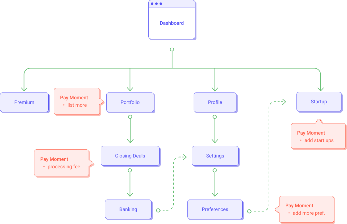
User Flow
For the user flow, the starting point is the dashboard. The user is able to navigate to four pages. As they continue, there are pay moments where they have the option to view or upgrade to the higher tier.
Sketches
Wireframes
I focused on decreasing the white space, making it more evenly spaced, as well as having less clicks to the end goal.
Deliverables
With the before and after, I was looking to improve the workflow, user experience, and theme. Presented here are my final prototypes sent to the stakeholders and a comparison of before and after.
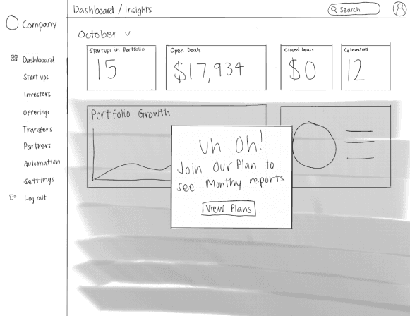
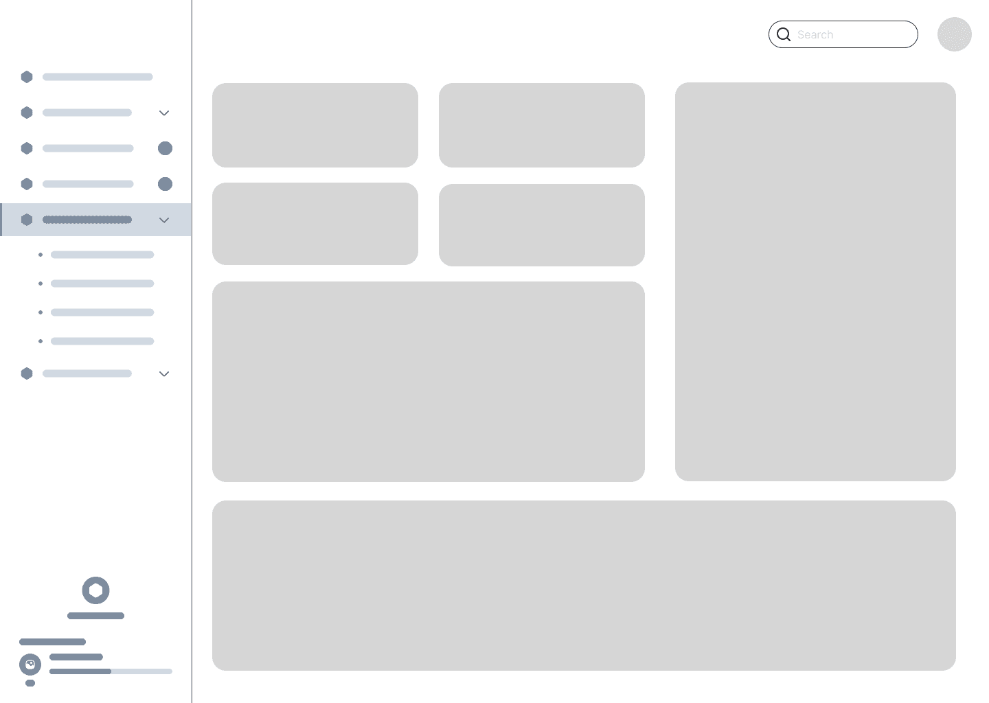
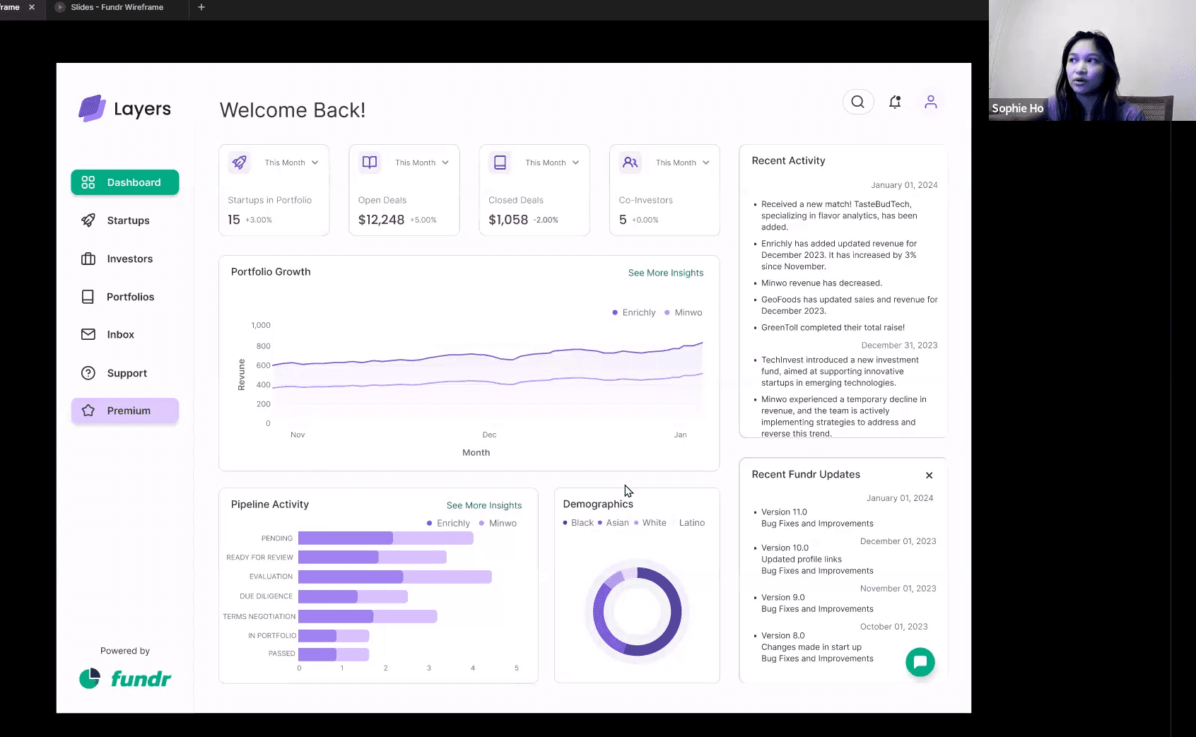
Dashboard
- I reimagined Fundr's dashboard and pitched new ideas to them. Having users experience their features before upgrading allows them to see the progress in their investment. - I have also included a place where the users can see any recent activity and Fundr updates.
Dashboard
- I reimagined Fundr's dashboard and pitched new ideas to them. Having users experience their features before upgrading allows them to see the progress in their investment. - I have also included a place where the users can see any recent activity and Fundr updates.
Dashboard
- I reimagined Fundr's dashboard and pitched new ideas to them. Having users experience their features before upgrading allows them to see the progress in their investment. - I have also included a place where the users can see any recent activity and Fundr updates.
Dashboard
- I reimagined Fundr's dashboard and pitched new ideas to them. Having users experience their features before upgrading allows them to see the progress in their investment. - I have also included a place where the users can see any recent activity and Fundr updates.
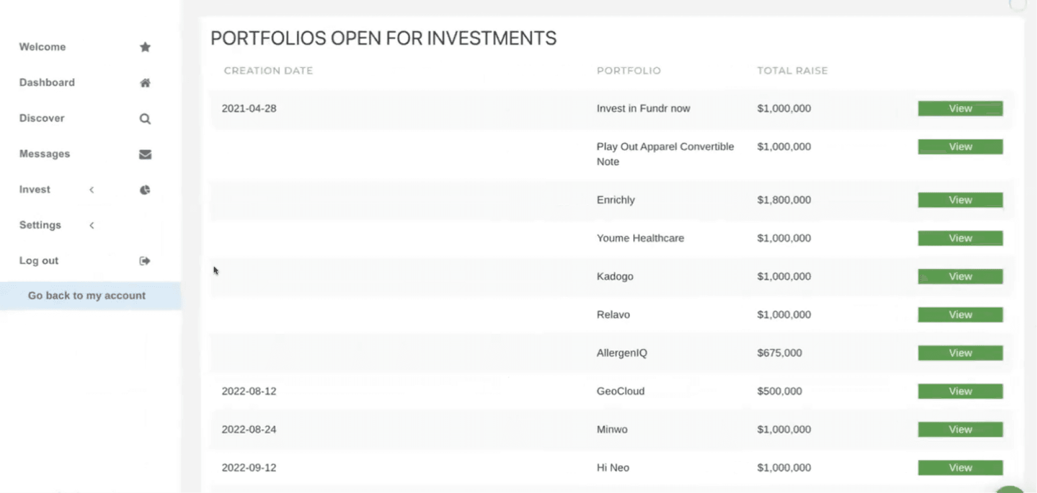
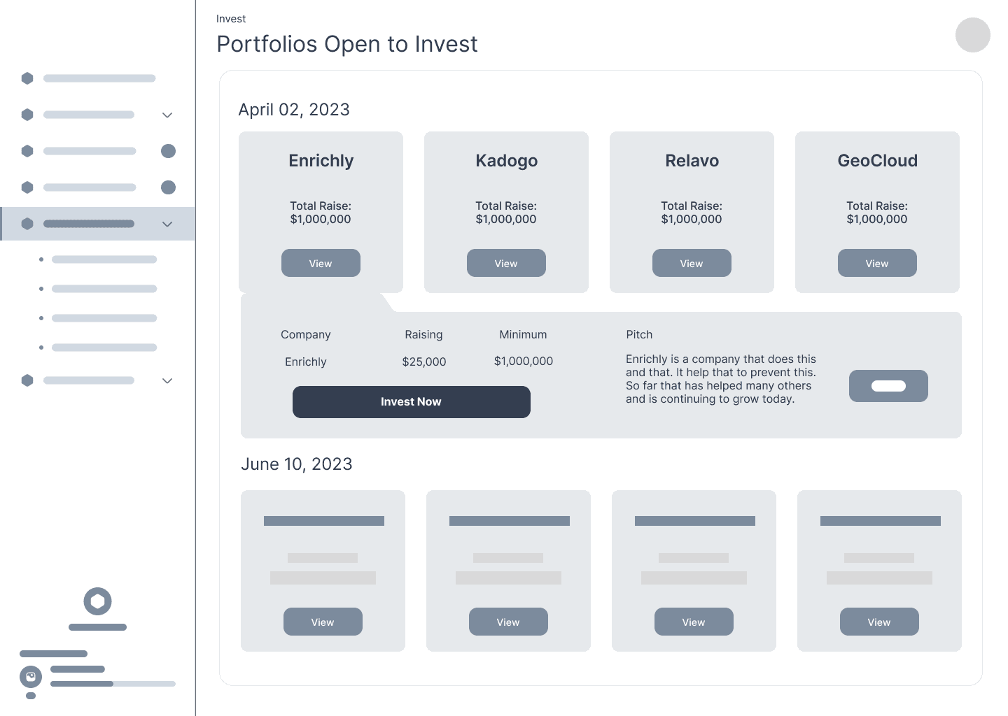
Portfolios Ready to Invest
- For users to read the information provided better, I made sure important information is easily accessible and quick to access.
Portfolios Ready to Invest
- For users to read the information provided better, I made sure important information is easily accessible and quick to access.
Portfolios Ready to Invest
- For users to read the information provided better, I made sure important information is easily accessible and quick to access.
Portfolios Ready to Invest
- For users to read the information provided better, I made sure important information is easily accessible and quick to access.
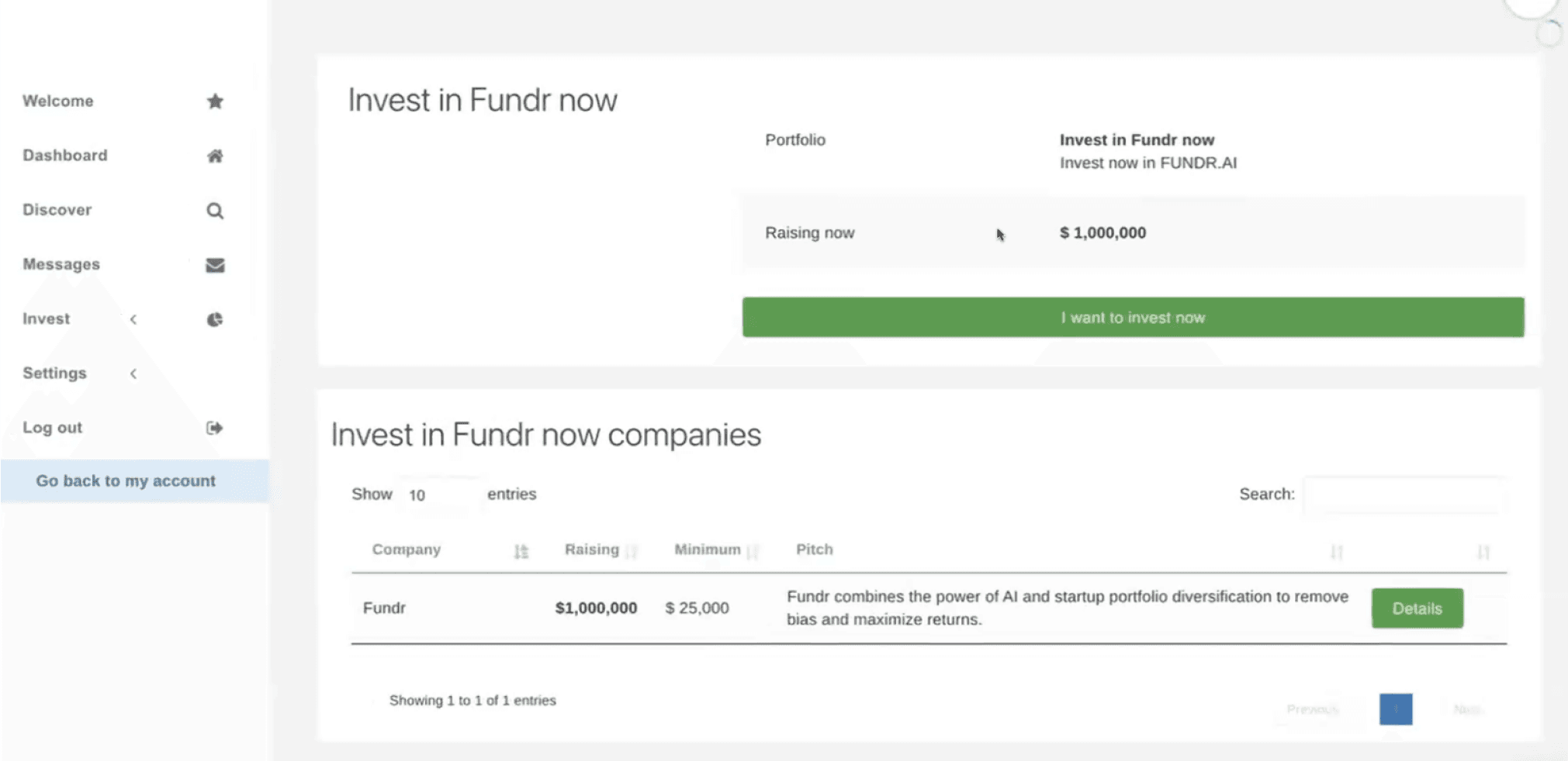
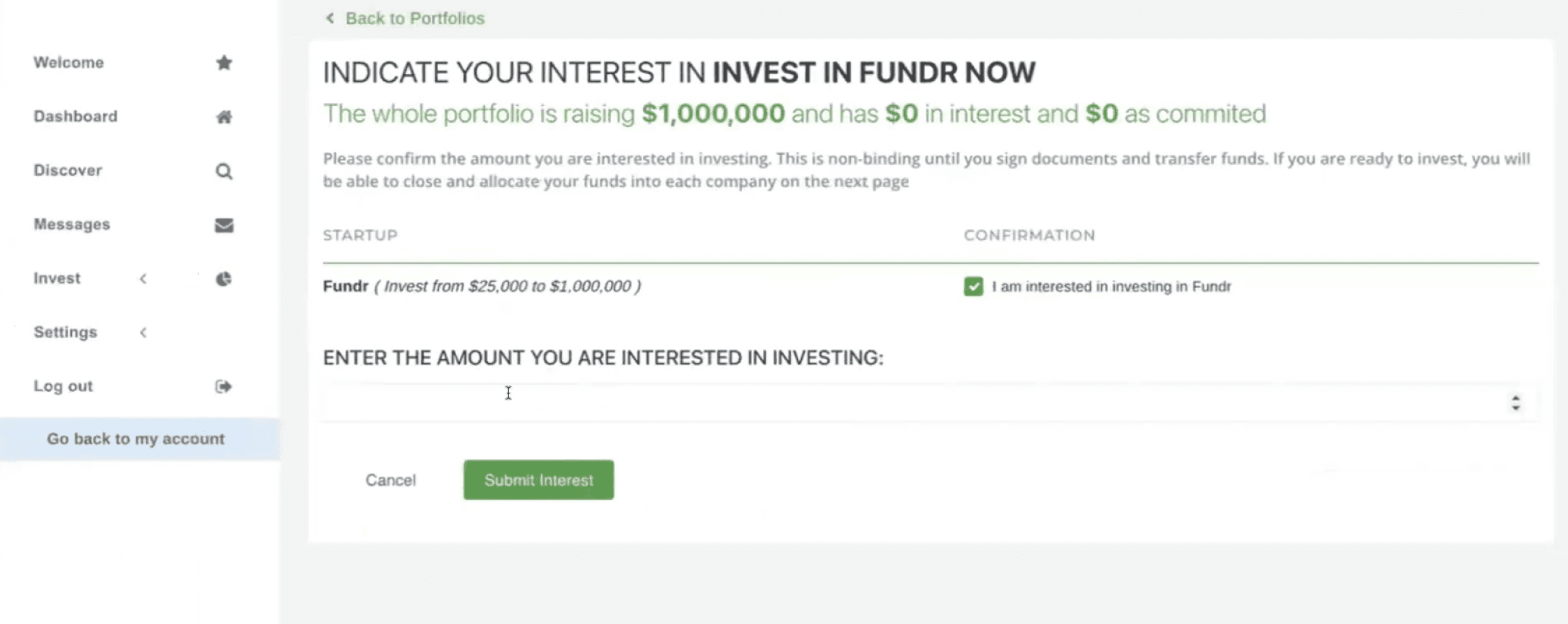
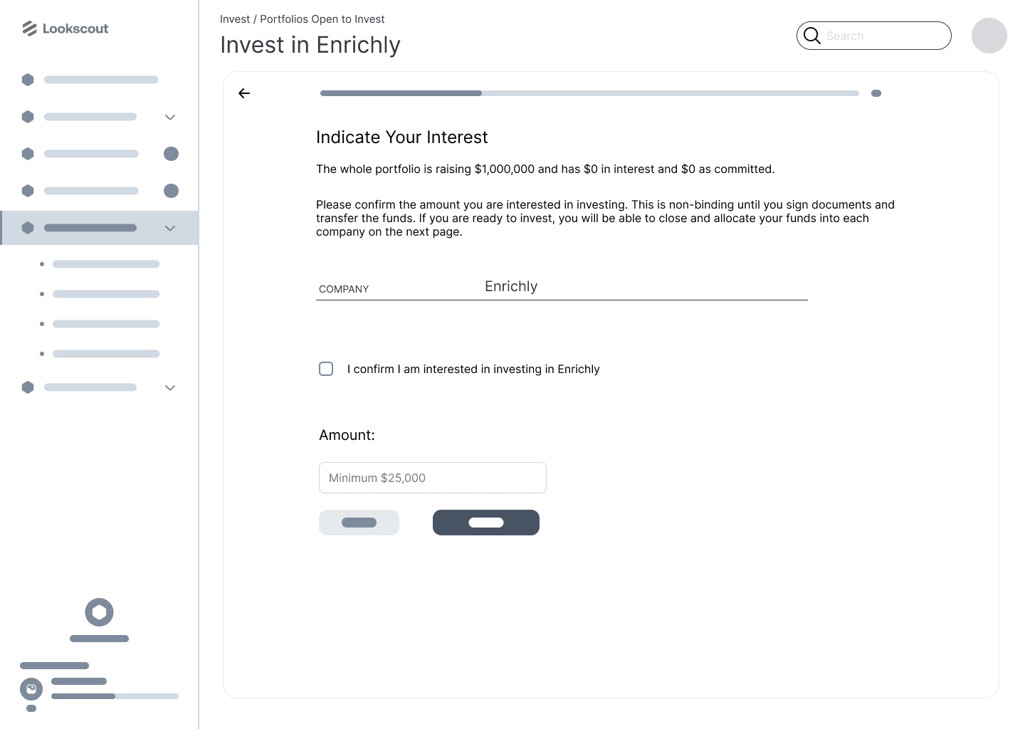
Invest in a Company
- I redesigned their form to allow the users to have a clear overview of what they are investing in. I also placed any processing fee within the form to be more transparent and ensure no hidden costs.
Invest in a Company
- I redesigned their form to allow the users to have a clear overview of what they are investing in. I also placed any processing fee within the form to be more transparent and ensure no hidden costs.
Invest in a Company
- I redesigned their form to allow the users to have a clear overview of what they are investing in. I also placed any processing fee within the form to be more transparent and ensure no hidden costs.
Invest in a Company
- I redesigned their form to allow the users to have a clear overview of what they are investing in. I also placed any processing fee within the form to be more transparent and ensure no hidden costs.
Settings/Banking
- Emphasized the importance of privacy and showing what companies are accepted. - Showed a better experience for the user to the stakeholder.
Settings/Banking
- Emphasized the importance of privacy and showing what companies are accepted. - Showed a better experience for the user to the stakeholder.
Settings/Banking
- Emphasized the importance of privacy and showing what companies are accepted. - Showed a better experience for the user to the stakeholder.
Settings/Banking
- Emphasized the importance of privacy and showing what companies are accepted. - Showed a better experience for the user to the stakeholder.
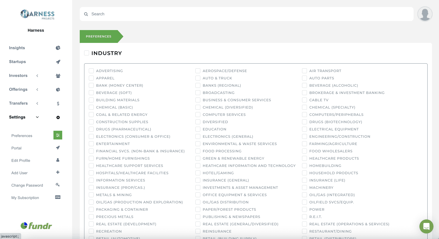
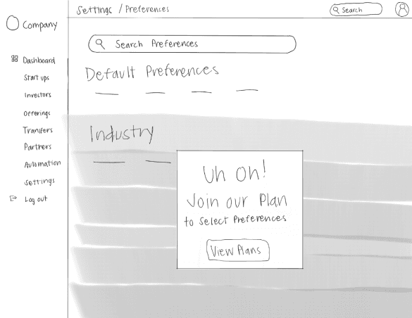
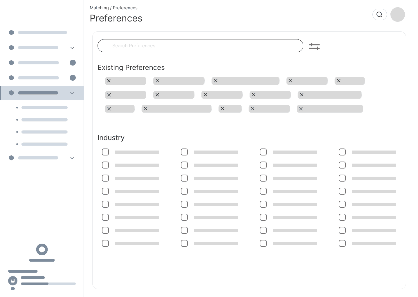
Settings/Preferences
- Implemented a paid upgrade moment where if users were to want to add more preferences they need to upgrade. - The main changes I have made were providing filters and collapse tabs for the user to easily access and navigate through the information.
Settings/Preferences
- Implemented a paid upgrade moment where if users were to want to add more preferences they need to upgrade. - The main changes I have made were providing filters and collapse tabs for the user to easily access and navigate through the information.
Settings/Preferences
- Implemented a paid upgrade moment where if users were to want to add more preferences they need to upgrade. - The main changes I have made were providing filters and collapse tabs for the user to easily access and navigate through the information.
Settings/Preferences
- Implemented a paid upgrade moment where if users were to want to add more preferences they need to upgrade. - The main changes I have made were providing filters and collapse tabs for the user to easily access and navigate through the information.
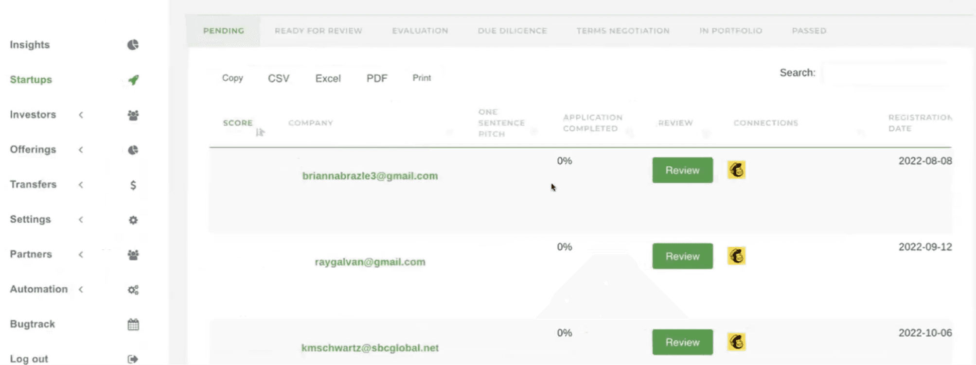
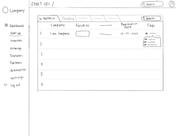
Startups
- Users are allowed a certain number of startups in their portfolio before they are hit with the upgrade. - Users can quickly view any updates or other important information such as status, related preferences, and estimation.
Startups
- Users are allowed a certain number of startups in their portfolio before they are hit with the upgrade. - Users can quickly view any updates or other important information such as status, related preferences, and estimation.
Startups
- Users are allowed a certain number of startups in their portfolio before they are hit with the upgrade. - Users can quickly view any updates or other important information such as status, related preferences, and estimation.
Startups
- Users are allowed a certain number of startups in their portfolio before they are hit with the upgrade. - Users can quickly view any updates or other important information such as status, related preferences, and estimation.
Premium
- Highlighted important information that would entice users. - Made sure to show add-ons that are available and payments that would happen throughout the platform to provide transparency. - Included user reviews to showcase other's experience on Fundr.
Premium
- Highlighted important information that would entice users. - Made sure to show add-ons that are available and payments that would happen throughout the platform to provide transparency. - Included user reviews to showcase other's experience on Fundr.
Premium
- Highlighted important information that would entice users. - Made sure to show add-ons that are available and payments that would happen throughout the platform to provide transparency. - Included user reviews to showcase other's experience on Fundr.
Premium
- Highlighted important information that would entice users. - Made sure to show add-ons that are available and payments that would happen throughout the platform to provide transparency. - Included user reviews to showcase other's experience on Fundr.
Great job on the redesign! I truly experienced a significantly improved user flow. The preview of features is a considerate touch that not only I've personally encountered but also prompted me to upgrade. Your design has inspired numerous ideas for further enhancements for Fundr.

Lauren Washington
Co-founder and CEO of Fundr
Conclusion
Final Thoughts
I thought of the customizable dashboard, empowering users to personalize their view. This feature adds a touch of individuality, making the platform more tailored to each user's preferences. Since I came into this project not knowing anything about investing, finance, and dashboard, there’s much more to learn about and test. There is tons of room for improvement.
Test
Final Thoughts
I thought of the customizable dashboard, empowering users to personalize their view. This feature adds a touch of individuality, making the platform more tailored to each user's preferences. Since I came into this project not knowing anything about investing, finance, and dashboard, there’s much more to learn about and test. There is tons of room for improvement.
Test